https://youtu.be/CFdah8zseT8
After a long process we've made it to the end !!!
Enjoy !
Sunday, April 7, 2019
FINAL POST
For my final post before I turn in my final product and CCR, I just wanted to reflect through the 7 weeks I had to complete my project. This project helped me with learning new technological techniques for editing and even creating an entire magazine. I had fun through the process but also had stress mixed in with it. Taking the photos and applying them onto the magazine, finding a font that would fit the overall theme, and most importantly the layout for the magazine. It wasn't an easy process and time and dedication was put into my work. Having to post weekly made me more interactive with my project and helped me constantly work on my magazine. What I liked overall was I was able to create my OWN magazine and be able to work with ideas I know well and it helped me be more engaged through the process. I can say that this was one of the top projects I've done throughout high school and it has been a great journey. I have finished all my final touches and can say it was a GRIND, now I'm ready to publish my work !
Sunday, March 31, 2019
We GRINDING
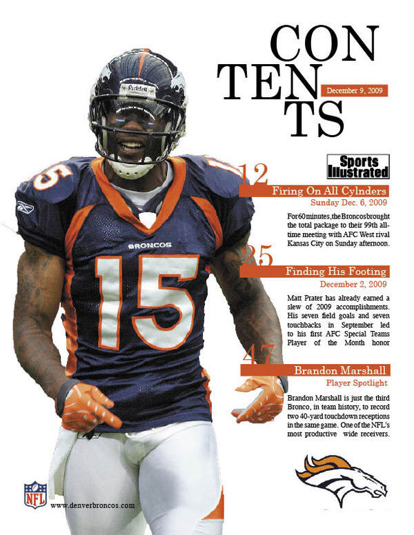
Now that our final week for working for this project is coming up and then we have to worry about the CCR video, I've managed to complete my cover page. here it is
I was able to create a PNG image but cutting out and cropping the background of the image I had with my main athlete. It was a long process that needed precision to be able to have the cut out fit with no flaws. Another choice I made was to have the color scheme match the jersey color of the athlete. I felt like this was a solid choice because it has a set tone to it and matches throughout the entire magazine. One last thing i had in mind was add an extra page for advertisement. I'm looking for using athletic merchandise from high schools and advertise them to fit the theme of my magazine.
Saturday, March 30, 2019
spring break
A quick update: So this past week I've been on spring break. I haven't been checking in recently because iv'e been traveling and not having much time on my hands. I got back into working on my project and tweaking some specs. I'm no where near done and need to get on a grind. I'm still looking forward to my final product and the hard work that has been put into this project.
Following this I realized I need to start working on my CCR and get that going to wrap everything up. We're almost to the end of this process and I'm excited to see the final outcome
Following this I realized I need to start working on my CCR and get that going to wrap everything up. We're almost to the end of this process and I'm excited to see the final outcome
Tuesday, March 19, 2019
Lets GRIND
New week and our fifth week of working on our project. For me it has really been about planning it all out these past weeks, but now is the time we begin the masterpiece. I'm really excited to start putting the pieces together and seeing my final outcome. I've been arranging pictures that I will be using within my magazine. Since i'm focusing on high school sports, my main athlete for my cover page will be Varsity Team captain for my High school boys basketball team. I'm actually really good friends with him, so this gives me an opportunity to interview him and get more insight from a highly ranked player that already has colleges looking at him. I feel like having him as a source brings more credibility and more interaction for my magazine.
Now is when everything gets put into one piece and I am excited for my final product, hope you guys will enjoy the rest of the ride !
Now is when everything gets put into one piece and I am excited for my final product, hope you guys will enjoy the rest of the ride !
Sunday, March 17, 2019
Finally !
So after looking through most of the website I found the font that I believe would fit my magazine theme the best. For titles of stories I was looking at the font "Knucklehead" by Mcraft Studio.
I chose this font because I felt like it fit the most for titles in the magazine. It has the bold feel to it just as it did for the masthead. I'd only be using this font for titles of the magazine.
Another thing I wanted to do was have a different font for the table of contents, but after thinking it over I feel like having the same font throughout the magazine would have a better look to it rather than having a full mix of different fonts. Now from here I will hopefully begin to apply everything into the magazine and get started!
DaFont ?
In the last group meeting I got one suggestion from a classmate on different fonts. Looking back at one of my last post I explained how I found the masthead font I wanted to use but had trouble finding out what font I would use for the rest of the magazine. The suggestion my classmate gave me was https://www.dafont.com/ This website has multiple fonts that could be downloaded and very easy to apply.
DaFont has many fonts to use and a variety of tools that can be used also. This recommendation was actually very good and helpful to continue my process. Now all I just need to do is look through and see the best font I could get to follow the scheme of my magazine!
Saturday, March 16, 2019
group meeting #2
Last class my classmates and I were able to get into groups and talk about our projects and ideas we had and be able to get feedback from different people. I felt like this group meeting helped me with building up confidence for my project. I was able to speak about my two page spread and get positive feedback about it and more ideas of how to format properly. This meeting I didn't have much to discuss about since I felt like I had most of my components ready to make my magazine. I also got feedback on how the font I have fits the overall magazine and was a good choice. The only criticism I got was how I wanted to layout my masthead. I wanted to go for a sports illustrated type of masthead where the main athlete would be placed in front of the masthead. The feedback I got was how my magazine isn't big yet, so covering up the masthead would not portray the title properly and would not allow viewers to know what magazine it is. My favorite feedback was about how original my idea was for making a magazine following high school sports. It's something that isn't seen much so that made me happy. But overall this group meeting was good and helpful to continue the process of my project, because at the end of the day it's all about the GRIND.
Wednesday, March 13, 2019
what font is going to be used ?
Since the name of my magazine is "GRIND" I was looking into having a sharp font that has a way of exploding the masthead. Something that gives the masthead importance and sharpness. The font I am experimenting with is "capture it" by Magique Fonts.

- I was looking into masthead being something aggressive like this font. I feel like this font gives the masthead a sharp feeling to it and relates to a sports theme.
- This font would be used for the Table Of Contents also to be able to have the same theme.
Sunday, March 10, 2019
struggling
So, this is going to be a quick post, just trying to get to the point. I have been struggling with just having my blue print set for my magazine. I'm having trouble on just sticking to one idea, when I know I can have the best magazine I can possibly make. I have trouble with deciding on things such as:
It's just the simple things that get me wanting to do more. I want viewers of my magazine to be able see the attention to detail and the work put into the magazine. After this week I will start the process of editing and bringing the magazine to life. Also start to have layouts and work with the color scheme to make it the best possible sports magazine I can do. It's not an easy project but the struggle is what is pushing me forward to perfect what I am capable of doing.
- Table of contents layout
- The font of the masthead
- certain pictures with high quality
It's just the simple things that get me wanting to do more. I want viewers of my magazine to be able see the attention to detail and the work put into the magazine. After this week I will start the process of editing and bringing the magazine to life. Also start to have layouts and work with the color scheme to make it the best possible sports magazine I can do. It's not an easy project but the struggle is what is pushing me forward to perfect what I am capable of doing.
Table of Contents
For my table of contents I want to have a opportunity to have convert images into a PNG and just have a nice layout to it. I've been looking into multiple sport magazine table of contents to give me an idea on what I should be trying to make and here is what I found:
This page caught my attention because of the layout and how the color scheme matches. For my magazine I would want my colors scheme to match to be able to have that eye catching effect to it.
Another T.O.C page I found interesting was:

Having a two page table of contents gives more room for editing and being able to use as much space as possible. I like the idea of having the two page because I would want to focus on the pictures and the detail to each one. I would want to apply all these images to be able to give the magazine the "sporty" feeling to it.
Saturday, March 9, 2019
The bigger idea..
I've had an idea on what I would want my two-page spread was going to be about. I was looking forward to writing about how High-school basketball players aren't allowed to get drafted right out of high-school unlike other sports such as baseball or even soccer. But looking into it, it seems like the problem with having high-school players be drafted is the NBA doesn't have "extra leagues" as other sports do. For example, Major League Baseball has different leagues to be able to develop the young drafted players or players that need more improvement like Single A division to Triple A division until you reach the Major leagues. But in contrast to this the NBA doesn't have a development league or ways to have young stars be able improve such as the pros. Not to spoil my entire two page spread now, but I would keep going with how that development is used throughout having these young stars be forced to enter college for a year before being able to declare for the draft, and the benefits this has to the NBA.
Aside from the research aspect, I was looking into being able to have different view points from a high school player on sports that allow you to be drafted from high-school to a high-school basketball player who isn't allowed to be drafted. I feel like being able to get these viewpoints from these star players would just bring the two-page spread some life.
One other thing I would like to have would be able to bring in a professional athlete into the magazine, and that would be Lebron James. I'm looking into adding Lebron due to his popularity and greatness, I would be adding him because of the path he took. "Following Lebron James' junior year of high school, the rising star petitioned the league so he could enter the 2002 NBA Draft at age 17. Alas, James was denied because he hadn't graduated from high school yet". Looking forward to this to be able to bring in the professional sports world into play with my High school magazine!
Just a couple ideas that I've been thinking of to start having an idea for the layout I would be looking for !!
Wednesday, March 6, 2019
Designing
I was wondering how I was going to be able to bring my magazine to life and be able to edit every aspect I can. So, I did some research on which software I was able to use and I landed on this easy,accessible and cheap app.


Indesign is a software created by adobe systems that works such as a 'photoshop' but has more access and easier manual to make posters, flyers and most importantly magazines
As you can see here, there is easy access to all editing tools needed to cut out an image or apply a different background. I'm looking forward to using this app to its full potential to be able to bring my magazine to life!
I would use this app for basically my entire editing process. Be able to insert athletes with vivid backgrounds, be able to create my table of contents and my two-page spread.
I would use this app for basically my entire editing process. Be able to insert athletes with vivid backgrounds, be able to create my table of contents and my two-page spread.
Sunday, March 3, 2019
Quick update
Here comes another post about my cover... Sorry about that but I just want to have a cover page that makes the audience want to see what the next cover issue would be. After doing more research, I was able to come across many different ways and creative ideas to make a great cover image!
1. Using a one point perspective


1. Using a one point perspective
- A one point perspective is basically the chance to have the cover image seem like it keeps continuing. The image would only have one vanishing point and would be opposite of the viewers eye.
2. Being able to play with illusions
- Having the cover being manipulated by the images would be a great way to have the Eye-Catching image that I want for my magazine.
3. Centering the Masthead
- Since my recent post have been about my masthead and figuring out what would work best, having the masthead centered would be different from most magazines where the basic cover would have the masthead on top. "This cover of Pilot, designed by Jase Mildren, gives the masthead pride of place in the center of the cover."
These were the top ideas I researched and found would be best to fit within my type of magazine designs. There still time to before the final product, But these ideas are taken into consideration for me due to the uniqueness.
Website
- https://www.canva.com/learn/magazine-cover-design/
Trying to make it the best !
I've been looking at my cover page and trying to see what I could do to make it eye-catching and creative. Looking into other magazines and how they were able to have their entire cover page to stand out, helped me with discovery what I could do. Since I don't have an idea yet of what my headline story would be yet. I was thinking of having my masthead blend into the main cover image.
From my research, I've noticed patterns of how sports magazines covers have the masthead positioned behind the cover athlete. For example:


These big sport companies are able to have a cover image that stands out but is simplistic also. These were the aspects I was looking for but I want to be able to create something different.
From my research, I've noticed patterns of how sports magazines covers have the masthead positioned behind the cover athlete. For example:
These big sport companies are able to have a cover image that stands out but is simplistic also. These were the aspects I was looking for but I want to be able to create something different.
Friday, March 1, 2019
Grind ?
I'm looking into making a masthead that catches the attention on high school athletes. "Grind" can be described as putting in the work needed to become great at one's craft. So I feel like having Grind in bold letters would be a masthead that would Fit the teen magazine since most kids try to commit or get drafted into collegiate or professional sports. This would be my idea of what I would want the Masthead to be.
I know it needs more work to it, but this would be the layout I would be looking for. Being able to have a simple cover page and but enough to catch the eye of viewers. "main athlete as cover page", my idea for it would be to have the entire background be filled with the athlete. Adding a unique background but portraying the athlete as the center piece. I'm looking into just keeping it simplistic yet eye catching.
Thursday, February 28, 2019
Group discussions
So, it's been a decent time I haven't posted here but that's because I was slacking. I actually missed 2 blog post I was supposed to do last week. But that's not the point. Today I was assigned a group to go over my FINAL portfolio project. We all had a chance to describe what we all were planning to do for our project and be able to give each other feedback on our "blue print". Since I need to fill you guys in, I'm working on a high school sports magazine issue. This magazine would be focusing on high school sports and discussions that go around the sports world. The main focus of today was how useful the group meeting was, how brainstorming together on each project helped each one of us have a better understanding and clear view of what others would expect from each project. We were all able to collaborate and came up with great ideas for my project. Here are a few ideas my group and I were able to come up with.
 I'm actually looking forward to getting in to groups and be able to discuss more about my project and get more diverse ideas from different students, and just attempt to reach the max capability I can with my magazine.

Wednesday, February 13, 2019
Music marketing campaign
About 2 weeks ago my Aice media teacher assigned a music marketing campaign that was actually fun to do about 2 weeks ago my Aice media teacher assigned a music marketing campaign that was actually fun to do. I'm not the type of person to get all excited about doing any type of projects but this one caught my attention. Being able to create a whole music campaign for MY own musician was an opportunity to show off my creativity skills. So basically my group and I came up with an idea of having a single musician within the soul genre beginning from scratch and build up to the top and explain our ideas on how we were going to accomplish to make our investment into the next big artist. The project consisted of basically having a blueprint of how we were going to build this artist and be able to expand him to his upcoming audience. Within this my group came up with ideas on creating different social media accounts, figuring out where and when our artist would be able to perform, such as bars or small musical events, making a whole website solely based on our artist and even construct a music video for our first song.
The research process was fulfilled with great ideas that past investors/artist did to get to where they are today. Most bands and artist had a main focus of having creative social media’s to match with their style. It was there ways to interact with their audience and keep them on their feet. Another strategy used was to keep the color scheme of their social media’s be the same on their website for merch, meetups, concerts etc. From our case study research from 21 pilots and paramore we were able to dig deep and find out before these musicians got more fame they started by featuring for bigger artist. So from these standpoints we found, we wanted to circle our blueprint on them to be able to have a similar plan like these award winning bands.
For our marketing strategies we had ideas to mainly focus on our merchandise, being able to expand to a variety of audiences through musical platform such as apple music and spotify, have a consistent posting and interactions through social media, streaming music videos through youtube, beginning our performances on smaller circumstances as bars and coffee shops, and updated website that would be easy to access. Another thing that we find that would be beneficial would to have eye catching flyers and posters spread around the city of where our musician would be playing in that week.
Basically from this project I learned that before becoming big time musicians anything media related, there should be a viewpoint of the investment being a business. There should be ideas and plans to what type of target audience we are aiming at and socioeconomics statuses. We also found how many music videos use shots based on the tempo of the song, mostly adding quick cuts or even a storyline within the song.
Subscribe to:
Posts (Atom)