New week and our fifth week of working on our project. For me it has really been about planning it all out these past weeks, but now is the time we begin the masterpiece. I'm really excited to start putting the pieces together and seeing my final outcome. I've been arranging pictures that I will be using within my magazine. Since i'm focusing on high school sports, my main athlete for my cover page will be Varsity Team captain for my High school boys basketball team. I'm actually really good friends with him, so this gives me an opportunity to interview him and get more insight from a highly ranked player that already has colleges looking at him. I feel like having him as a source brings more credibility and more interaction for my magazine.
Now is when everything gets put into one piece and I am excited for my final product, hope you guys will enjoy the rest of the ride !
Tuesday, March 19, 2019

Sunday, March 17, 2019
Finally !
So after looking through most of the website I found the font that I believe would fit my magazine theme the best. For titles of stories I was looking at the font "Knucklehead" by Mcraft Studio.
I chose this font because I felt like it fit the most for titles in the magazine. It has the bold feel to it just as it did for the masthead. I'd only be using this font for titles of the magazine.
Another thing I wanted to do was have a different font for the table of contents, but after thinking it over I feel like having the same font throughout the magazine would have a better look to it rather than having a full mix of different fonts. Now from here I will hopefully begin to apply everything into the magazine and get started!
DaFont ?
In the last group meeting I got one suggestion from a classmate on different fonts. Looking back at one of my last post I explained how I found the masthead font I wanted to use but had trouble finding out what font I would use for the rest of the magazine. The suggestion my classmate gave me was https://www.dafont.com/ This website has multiple fonts that could be downloaded and very easy to apply.
DaFont has many fonts to use and a variety of tools that can be used also. This recommendation was actually very good and helpful to continue my process. Now all I just need to do is look through and see the best font I could get to follow the scheme of my magazine!
Saturday, March 16, 2019
group meeting #2
Last class my classmates and I were able to get into groups and talk about our projects and ideas we had and be able to get feedback from different people. I felt like this group meeting helped me with building up confidence for my project. I was able to speak about my two page spread and get positive feedback about it and more ideas of how to format properly. This meeting I didn't have much to discuss about since I felt like I had most of my components ready to make my magazine. I also got feedback on how the font I have fits the overall magazine and was a good choice. The only criticism I got was how I wanted to layout my masthead. I wanted to go for a sports illustrated type of masthead where the main athlete would be placed in front of the masthead. The feedback I got was how my magazine isn't big yet, so covering up the masthead would not portray the title properly and would not allow viewers to know what magazine it is. My favorite feedback was about how original my idea was for making a magazine following high school sports. It's something that isn't seen much so that made me happy. But overall this group meeting was good and helpful to continue the process of my project, because at the end of the day it's all about the GRIND.
Wednesday, March 13, 2019
what font is going to be used ?
Since the name of my magazine is "GRIND" I was looking into having a sharp font that has a way of exploding the masthead. Something that gives the masthead importance and sharpness. The font I am experimenting with is "capture it" by Magique Fonts.

- I was looking into masthead being something aggressive like this font. I feel like this font gives the masthead a sharp feeling to it and relates to a sports theme.
- This font would be used for the Table Of Contents also to be able to have the same theme.
Sunday, March 10, 2019
struggling
So, this is going to be a quick post, just trying to get to the point. I have been struggling with just having my blue print set for my magazine. I'm having trouble on just sticking to one idea, when I know I can have the best magazine I can possibly make. I have trouble with deciding on things such as:
It's just the simple things that get me wanting to do more. I want viewers of my magazine to be able see the attention to detail and the work put into the magazine. After this week I will start the process of editing and bringing the magazine to life. Also start to have layouts and work with the color scheme to make it the best possible sports magazine I can do. It's not an easy project but the struggle is what is pushing me forward to perfect what I am capable of doing.
- Table of contents layout
- The font of the masthead
- certain pictures with high quality
It's just the simple things that get me wanting to do more. I want viewers of my magazine to be able see the attention to detail and the work put into the magazine. After this week I will start the process of editing and bringing the magazine to life. Also start to have layouts and work with the color scheme to make it the best possible sports magazine I can do. It's not an easy project but the struggle is what is pushing me forward to perfect what I am capable of doing.
Table of Contents
For my table of contents I want to have a opportunity to have convert images into a PNG and just have a nice layout to it. I've been looking into multiple sport magazine table of contents to give me an idea on what I should be trying to make and here is what I found:
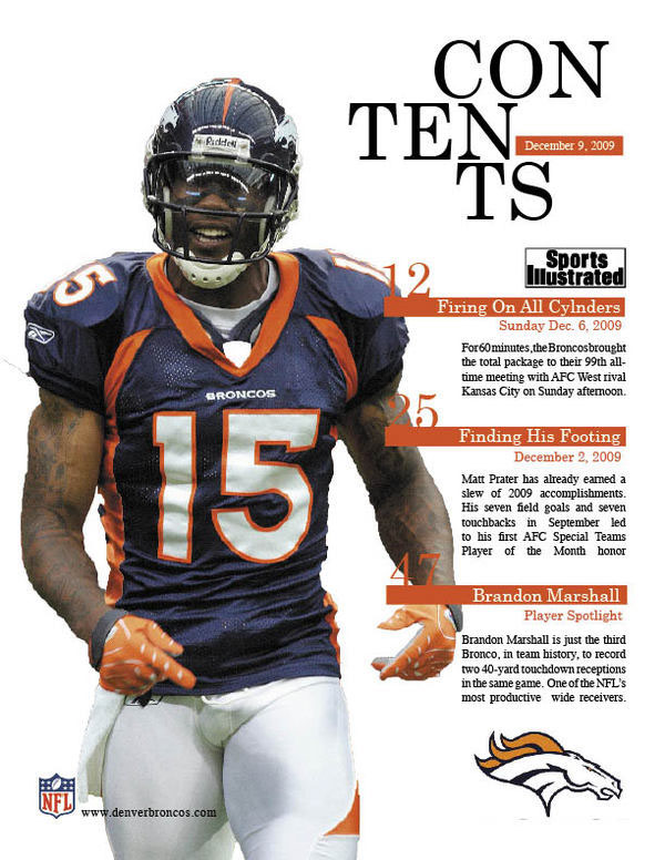
This page caught my attention because of the layout and how the color scheme matches. For my magazine I would want my colors scheme to match to be able to have that eye catching effect to it.
Another T.O.C page I found interesting was:

Having a two page table of contents gives more room for editing and being able to use as much space as possible. I like the idea of having the two page because I would want to focus on the pictures and the detail to each one. I would want to apply all these images to be able to give the magazine the "sporty" feeling to it.
Subscribe to:
Posts (Atom)